Health & Fitness
BoE spending in a chart form.
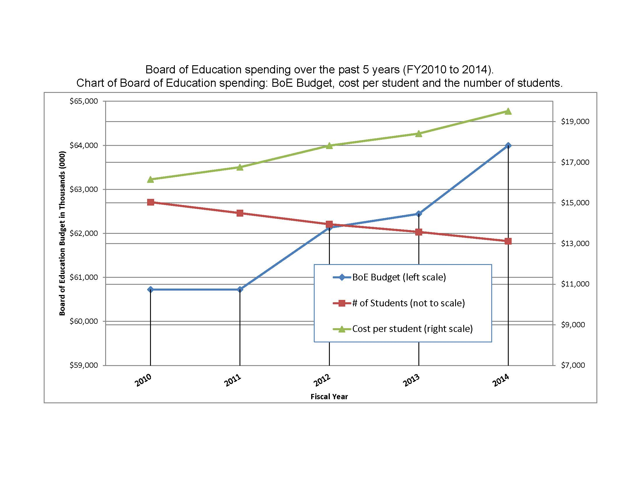

Sometimes a picture IS worth a thousand words. Attached to this post are two charts to graphically explain the facts. Remember Education represents ~70% of every dollar spent by the Town of Windsor. The charts show the BoE budgets from 2000 to the present and 2010 to the present. The left side scale is just the BoE budget and does not include Town Aid for Education ($4MM for FY 2014). The right side is per pupil spending. I have overlaid the number of students over the same periods. Now consider any enterprise for profit or ‘not-for-profit’ and tell me how long they can continue to operate like this? If your answer was none, you are reasonably correct. Only in government with no check on spending can you see anything like this. As long as you the voters are unwilling to say ENOUGH and vote NO! May 14, we can only anticipate the trend lines will continue. Who is that good for? You can answer that question.